Leave No Trace principles limit our wilderness take home pay to memories and photographs. Since memories quickly fade with age, we should probably give these photograph things a snap more exposure. Professional photographers aside, most of us set our artistic dial on decent. Decent seems to be the minimum level necessary to achieve a Facebook like.
 Most casual wilderness photographers are more concerned about camera weight and battery life than the light gathering capabilities of a 300 millimeter lens. After all, cameras are lower on the survivalist’s hierarchy of needs than say food and water. We certainly want our memory maker to perform in the wilderness, but if it approaches the size and weight of a lunch box, we may be tempted to simply open it up and eat all 32 mega bytes.
Assuming a small camera with some easy to use features, what can we focus on to improve our decent-cy?
Before we zoom in on that, we should explore the difference between impact and intent. Impact is what the observer thinks and feels examining our photograph. Intent is what we actually meant to convey. Not surprisingly, these can be in conflict. For example, a dark shadow can create a partially obstructed view filled with ominous feelings of voyeurism. Or it can simply mean our fat finger got in the way and ruined the shot.
Understanding how the camera can be manipulated to create various emotional effects can increase the odds that impact and intent, if not married, are at least dating,
Rule of Thirds
 The first place to start is the frame. Regardless of any camera settings, if what we are pointing at is not particularly interesting or pleasing, the final picture probably won’t be either. Some argue that with today’s high mega pixel density, we can shoot wide and improve by cropping later. But let’s be honest. We are probably going to post this straight to Facebook, so let’s just act like we give a crop.
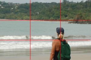
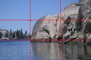
The little autofocus cross-hairs in most cameras encourage us to point directly at our subject. After all, if we are taking a frantic shot of an approaching black bear, we want it to be in focus, and we want it to be in the frame. Unfortunately, humans do not find dead center particularly pleasing. Research, probably involving cruelty to animals, eventually revealed the rule of thirds. If we divide a picture frame into horizontal and vertical thirds, main subjects along the lines and at the intersections are more aesthetically pleasing. For example, a face looking left appears pleasing positioned on the right third. A face looking right appears pleasing positioned on the left third. To highlight an impressive foreground, we place the horizon on the top third. If we want to irritate the observer subconscious, we place the horizon dead center, or even worse, tilt it slightly.
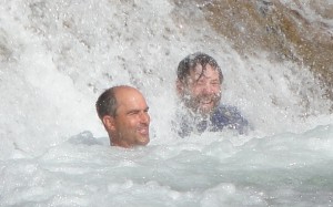
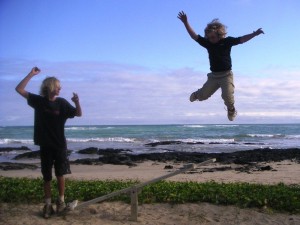
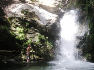
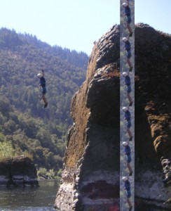
 In this action landscape, the water is positioned on the lower third line. My cliff-diving son is pleasingly positioned in the upper left sweet spot. If we compare impact and intent, we may find in this case that the impact is, well, frankly just impact. And pretty darn painful impact if I remember right.
Beware of the Digital Zoom
A convenient way to crop a picture is to use the zoom. Some cameras have an optical zoom, some a digital zoom, and some have both. Both zooms make the target seem closer, but they do so in very different ways. Where possible, turn off the digital zoom. It is not increasing the amount of data you have to render a quality picture, it is simply blowing up the pixels that are already there. Anything you can do with a digital zoom can be done better in software later.
Lighting
Photography literally means writing with light. The more dramatic the light, the more dramatic the write. Mornings and evenings, with impressive long shadows, are a great times for pictures. Where practical, we should inform our wildlife friends that we prefer they perform during these magic hours. Regardless of the actual performance time, as we compose our decent pictures we should be conscious of the primary lighting source. Is it side lit, top lit, back lit, or front lit? Each creates a very different feel. Front lighting is the safest, albeit most boring form. Our flash can be used even in daylight to provide fill, but given the proximity to the lens, beware of the dreaded red eye. Unless of course the devil monster look was indeed our intent.
Focus
Nothing changes a picture from decent to indecent more quickly than lack of focus. Well, actually there may be some things, but we are certainly not going to uncover them here. Most point-and-click cameras offer autofocus. In the uncontrollable wild, where nature appears and disappears in an instance, autofocus may mean the difference between Bigfoot and Bigblur. When less urgency is required, we can have both focus and pleasing cropping by pointing at our main subject, pressing half way down for auto-focus, and then re-framing the picture before pressing the rest of the way.
The Light Benders
It’s fairly obvious that all cameras require light to create an exposure. The amount is influenced by three inter-dependencies:
- the size of the hole – aperture
- the duration of the exposure – shutter speed
- the sensitivity of the sensor – ISO speed
These light causes create a variety of photo effects, which are either blessings or curses, depending on our intent. Almost all point-and-click cameras offer ways to influence these settings, though it may not always be obvious how.
Aperture
 Aperture is simply the size of the opening which allows in light. The primary effect from aperture is depth of focus. The larger the opening, the smaller the depth of focus.
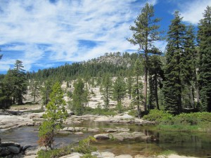
A tiny aperture can create a landscape picture where the plants in the foreground and the mountain peaks in the background are both in sharp focus. This picture calls attention to everything and nothing at the same time.
 A large aperture create a narrow depth of focus. In this photo, a large aperture creates a image where the blue tongue lizard is in sharp focus, but everything in the background is blurred out. Dramatic attention is drawn to the objects in focus.
Shutter Speed

Shutter speed determines how long the picture is exposed to light. A fast shutter speed will freeze the action in flight. It is great for limiting blur for fast moving subjects or shaking hand held cameras.
 A slow shutter speed will allows us to take photos in lower light, and create a blur effect which enhances the illusion of movement in a still picture. For extremely slow speeds, a tripod may be necessary so that only the moving objects are blurred.
Film Speed
Film speed (ISO speed) determines the sensitivity of the light gathering process. In most cases there is a trade off between speed and image graininess. The lower the speed, the finer the grain. The higher the speed, the larger the grain.
Inter-dependency
There are inter-dependencies between all of these settings. A choice in one will impact the others. For example, for a low light landscape demanding great depth of focus, we set a very small aperture. To make up for the decreased amount of light coming through this tiny aperture, we either need to set the shutter speed lower (increasing motion blurs) or the film sensitivity higher (increasing graininess). Similarly, if we want to freeze a water fall we set a high shutter speed. To make up for the limited time for light exposure, we have to increase the aperture (decreasing the depth of focus) or increase the film speed (increasing graininess).
There has to be an easier way!
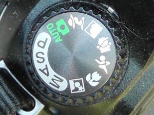
 Because these controls are so fundamental to photography, most point-and-click cameras offers them, but in a much more friendly mode, such as presets. Presets are control settings which offer sweet spot combinations, organized by their most common situation. Since the digital camera can deal with the inter-dependencies, we just need to set the priority, and the other settings will be handled automatically. Although not standardized, there are some common icon images to identify each. Here are some examples:
- Action Mode (a running man?): Forces shutter speed to fast to create a blur free picture. Results: Image frozen in time. Helpful for hand held shots
- Landscape Mode (a mountain range?): Forces aperture to small to create a large depth of focus. Results: Foreground and background in focus. In low light, this may require a tripod if shutter speed is too slow.
- Portrait Mode (a person profile?): Forces aperture to large to create narrow depth of focus. Results: Target sharp but background blurry.
- Night Mode (a star?): Forces shutter speed to slow to increase light and fill flash turned on. Results foreground well light, background darker but in focus.
Given that preset do not really know what we are photographing, we can trick them into other uses. For example, portrait mode will likely result in a picture with the background blurred. If we want a portrait with the background in focus, we can use the landscape mode. Do not fear, it will not make our subject look like a mountain. Unless, of course, they already do.
The Photo Finish
Unlike the days of development fees and limited film stock, digital pictures are cheap and instant. If we don’t like the landscape picture we just took, we delete it and take another. We can try the same framing with each of the available presets. We can vary the framing. Taking a wide variety of pictures not only lets us throw a handful of darts at our target, it also lets us draw the target after we have thrown the darts.
Just because it is easy to capture a massive quantity of varied images does not mean they represent quality. We should find in our virtual pile the very few decent ones, the ones we really like and post those. With any luck, others will Facebook like them too.
